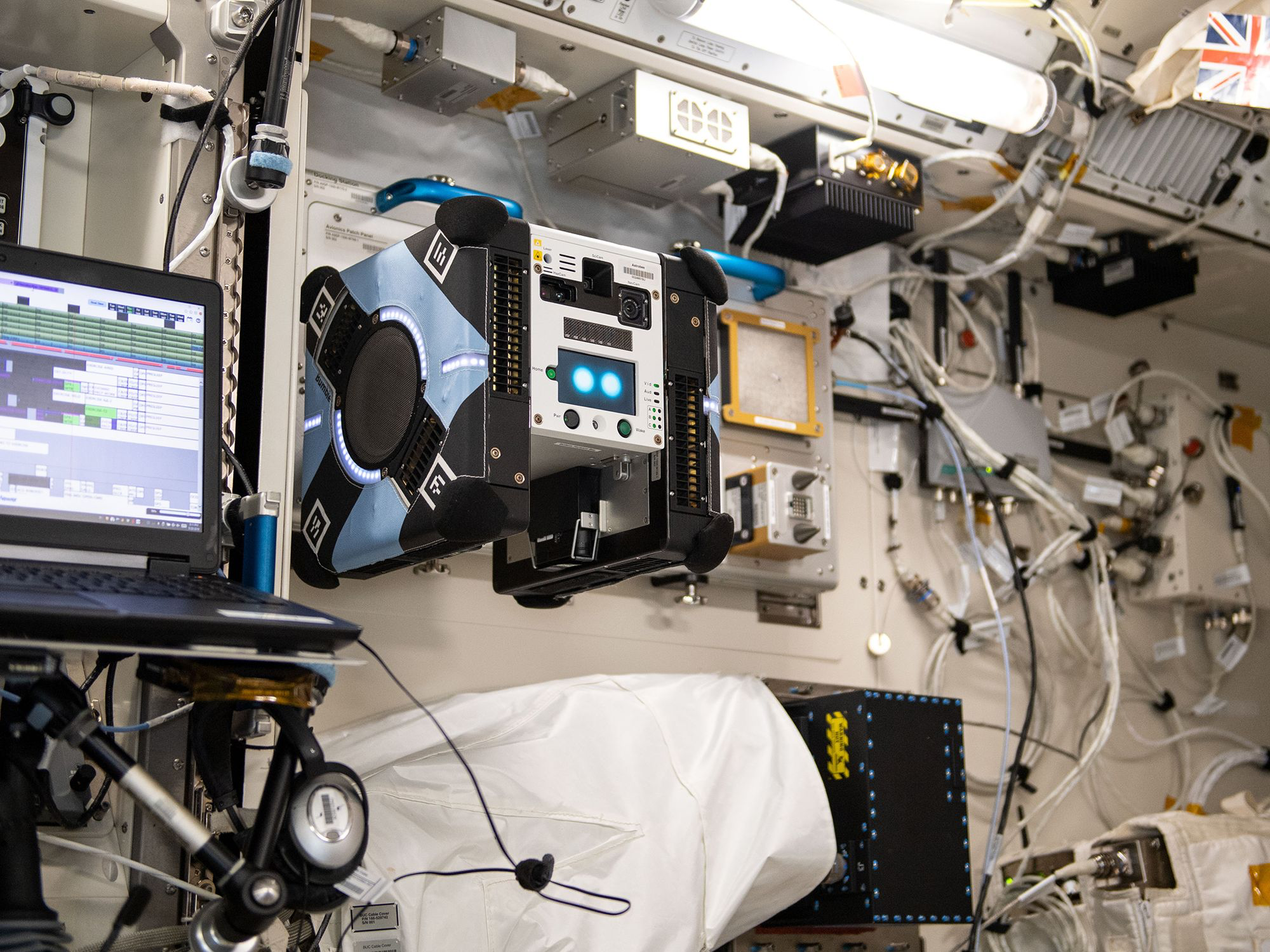
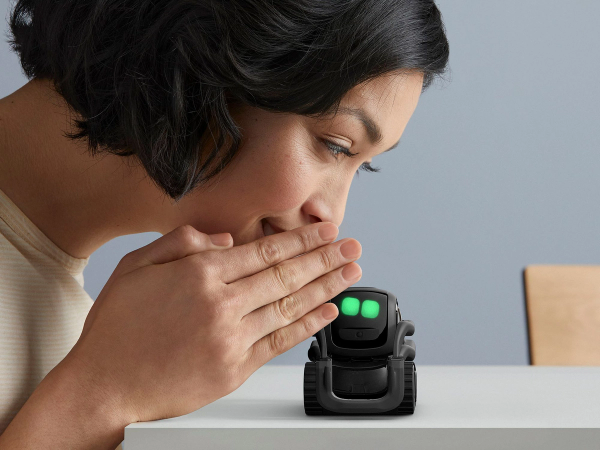
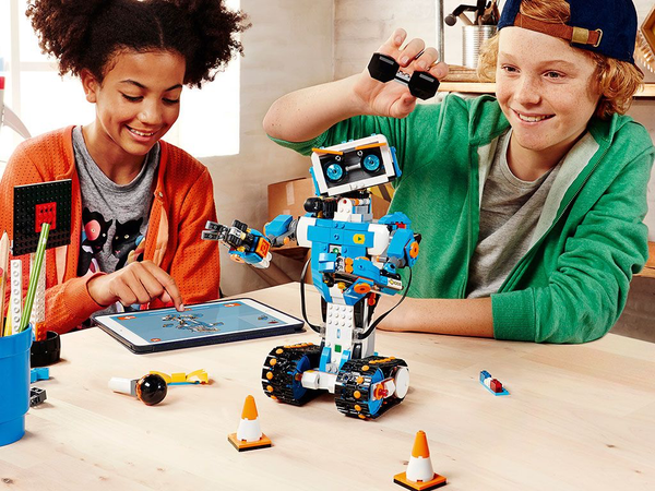
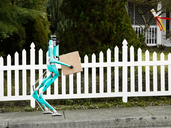
IEEE Robots
The new design builds on the recently launched Spectrum brand, sharing its typography and color palette while giving ROBOTS its own identity. ABC Favorit serves as the primary typeface, paired with Ivar for article text. The interface appears in a dark theme by default (with light mode available), and each section features a unique accent color to support navigation and orientation.
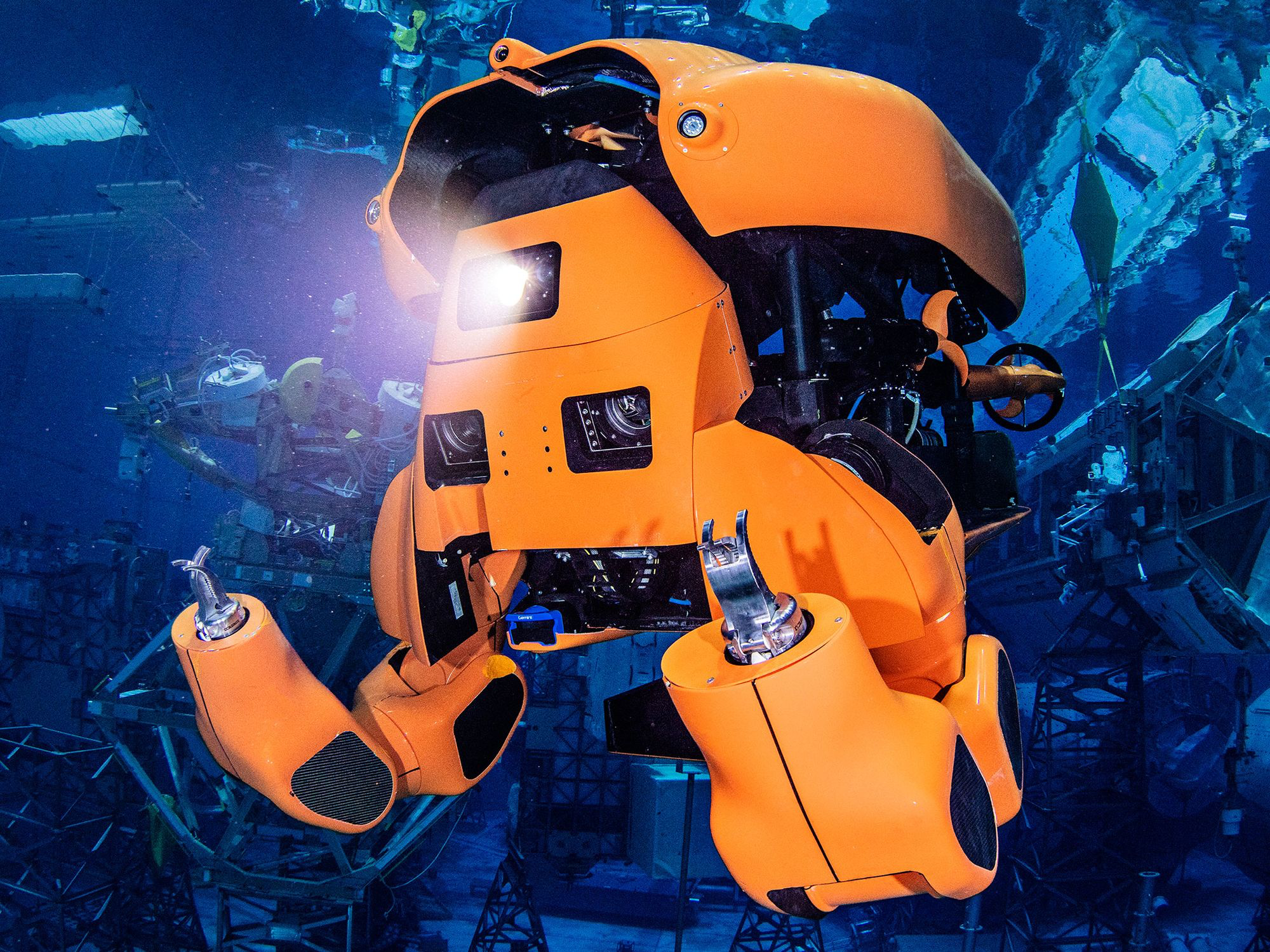
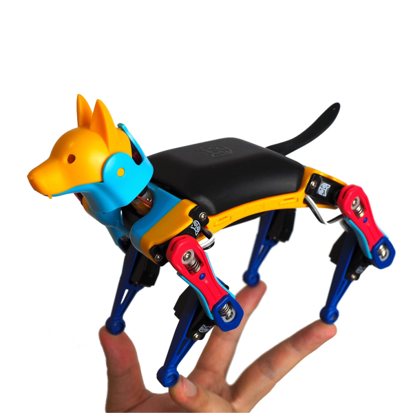
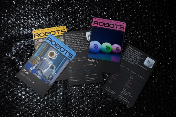
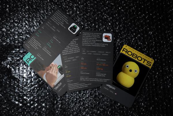
With a dual audience of industry professionals and young students, the visual system strikes a balance between technical detail and playful engagement. Images are large and colorful. Hover states are animated and bubbly. Features including robot ratings, leaderboards, and games provide visitors a way to interact with and influence the site.
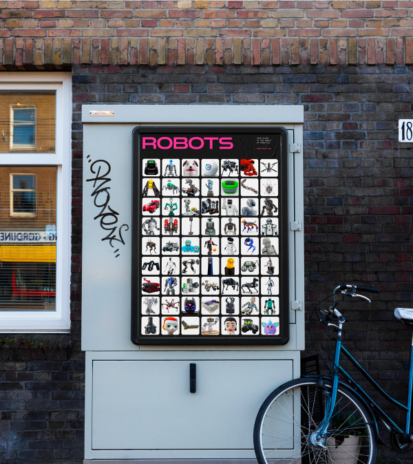
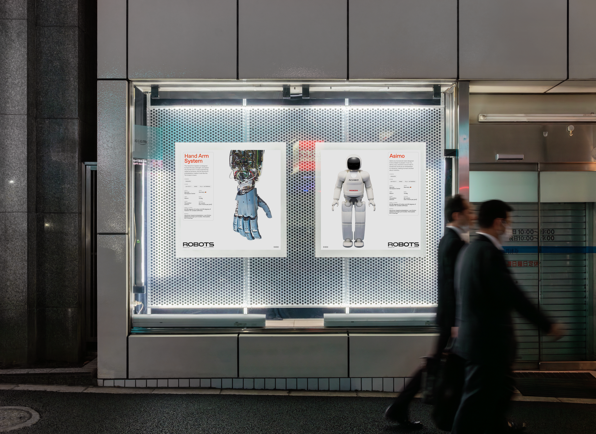
A key design challenge—and opportunity—was transforming the catalog’s deep well of structured data into an interface that feels intuitive, inviting, and full of possibility. We designed visual patterns that surface metadata throughout the site. Category tags appear directly on robot cards, providing context and guiding users toward broader groupings. From there, filters, search tools, and dynamic sorting options allow visitors to explore patterns across the catalog—like trends by country, use case, or capability. The interface facilitates both focused exploration and casual discovery, revealing the catalog not just as a collection of robots, but as a living dataset with stories to tell.
Groupings of robots are also highlighted on the homepage. A playful “easter egg” feature lets users shuffle through random collections with a click, keeping the experience fresh with every visit.
Structured data was key to powering the new ROBOTS site. To manage and deliver content as data, we chose Sanity.io—a flexible headless CMS that treats all content as structured data, enabling powerful, dynamic capabilities not possible with traditional systems.
This flexibility was critical for keeping the site fresh with minimal editorial effort, since the Spectrum team manages ROBOTS only part-time. The homepage can update itself algorithmically, regularly refreshing with new robots and content. Editors can choose to feature specific robots, but the system works independently by pulling from Sanity’s structured data.
We used a similar approach for the robot profile pages. Each robot has a unique set of data—some with more details than others. To handle this, we built an algorithm that dynamically generates each layout based on the data available, ensuring a clean presentation without manual edits. The layout adapts fluidly to different combinations of text, images, videos, and specs.
To make all of this manageable, the editorial team needed a powerful CMS interface. Sanity’s customizable Studio offered just that—with features like version control, drafts, previews, and real-time collaboration. And since it’s built in React, we could also design custom inputs and workflows to fit our exact needs.
The ROBOTS site was built as a Remix app running on Cloudflare Workers, providing high performance and flexibility at the edge. This modern architecture supported both the algorithmic layout system and new, interactive data exploration features.
While the robot catalog had long served as a resource for learning about individual robots, we saw untapped potential in its aggregate data. What if users could explore broader trends—like which countries build the most humanoids, or how often AI appears in robot designs? To unlock this, we made the catalog’s structured data explorable through filtering and sorting tools.
We introduced a new taxonomy system of categories and features, allowing users to dynamically filter, sort, and combine data—revealing patterns and insights across the robotics landscape.
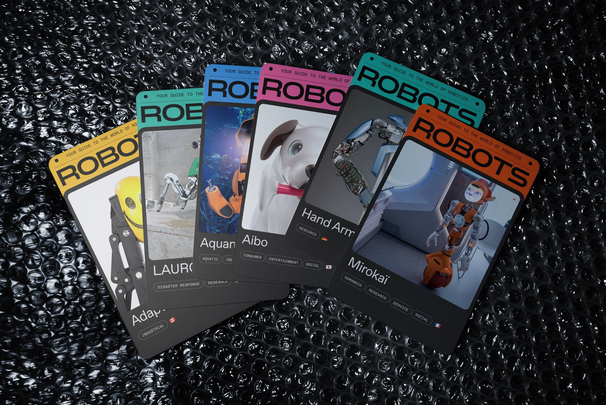
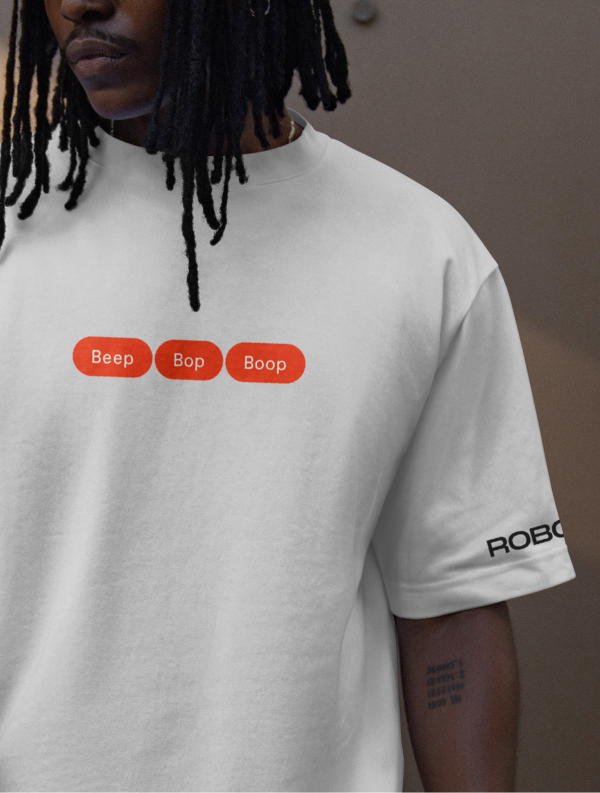
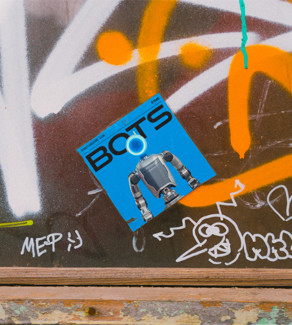
The ROBOTS brand can also extend beyond the digital realm, with potential for robot card decks, stickers, and swag.
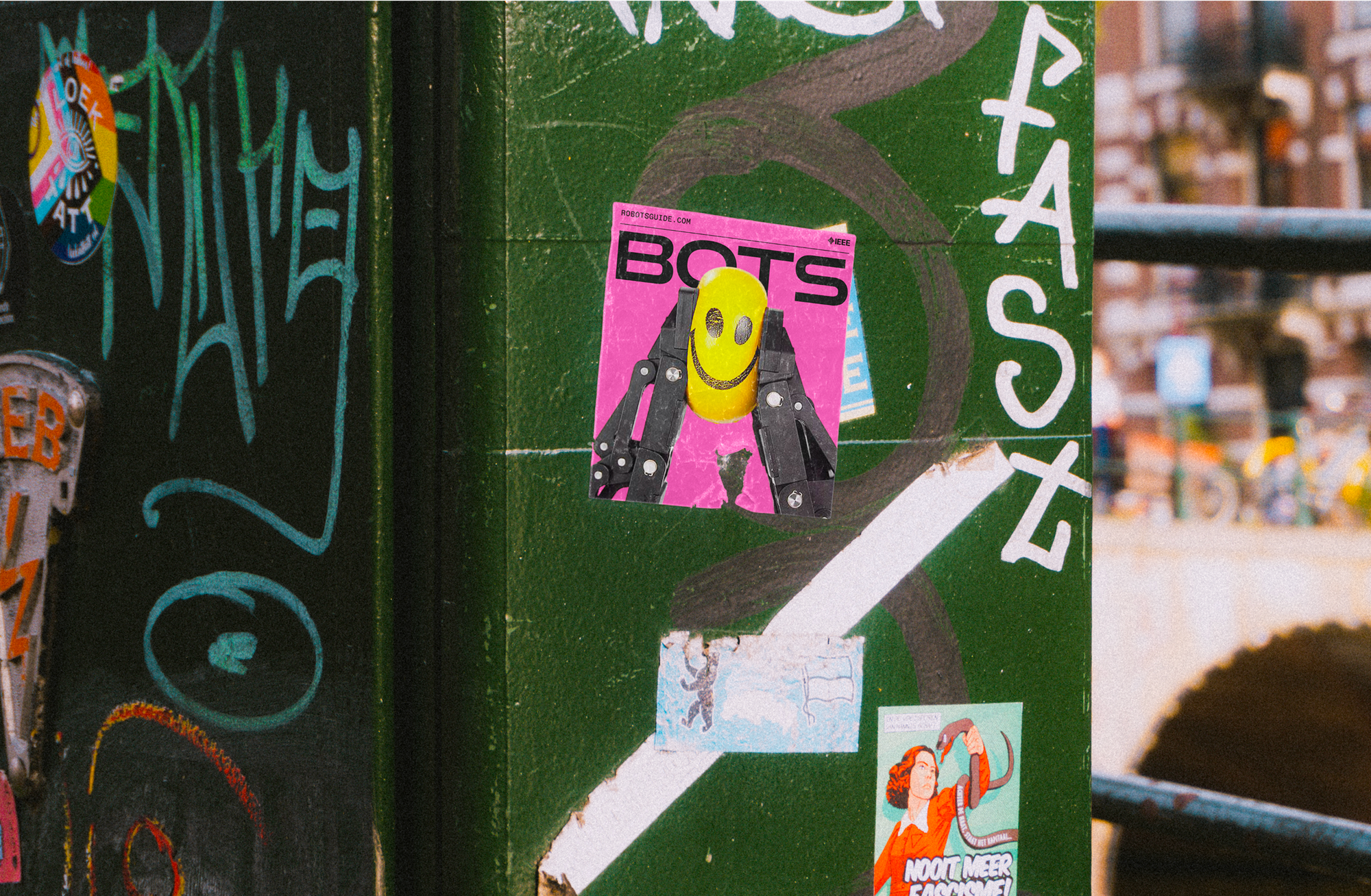
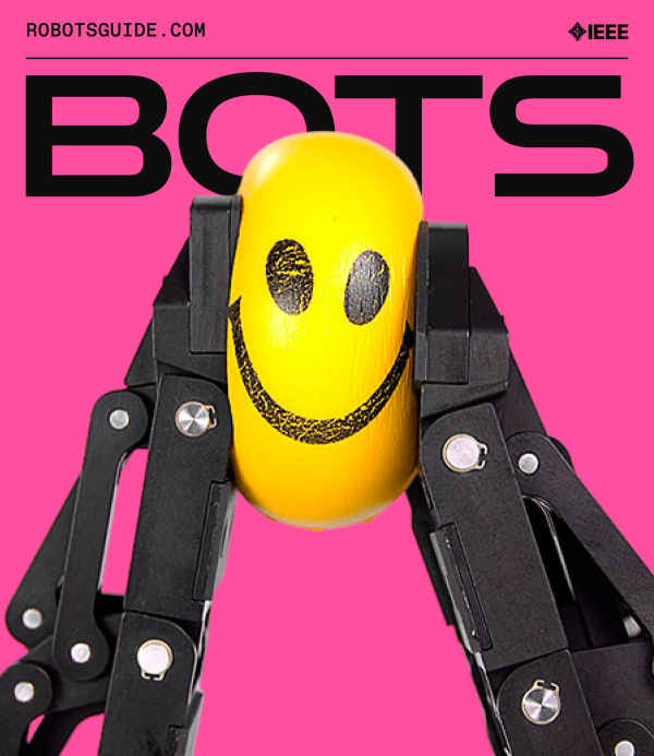
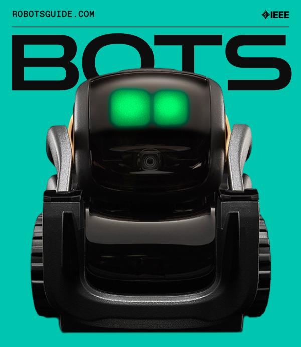
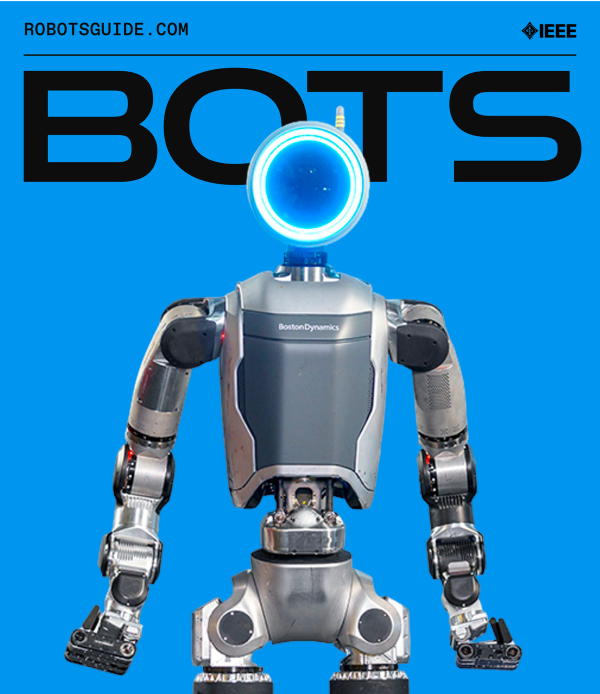
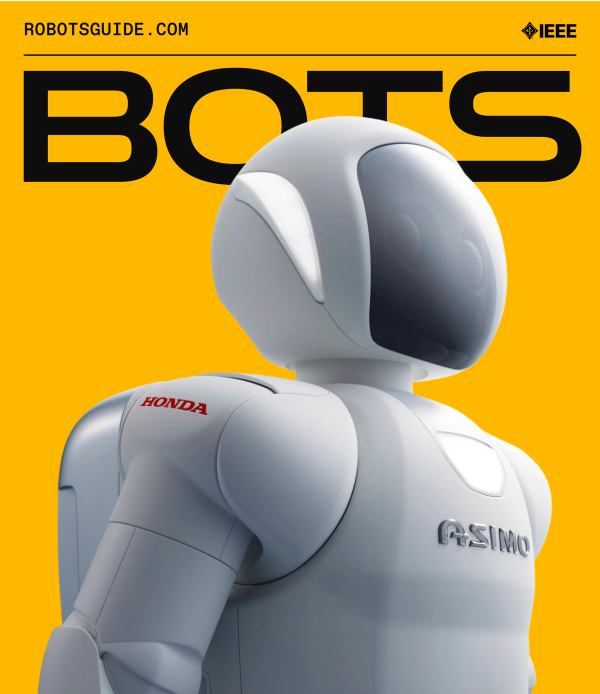
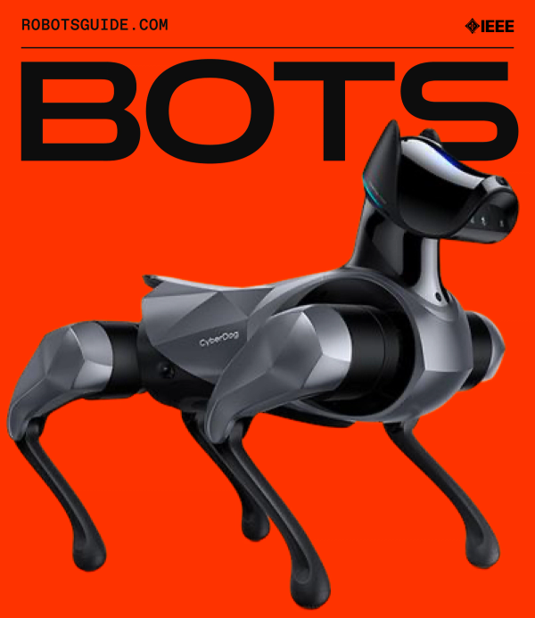
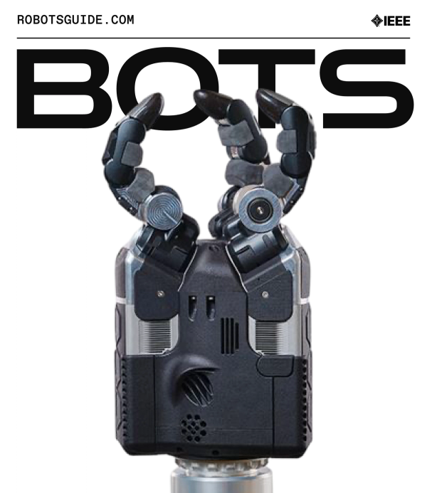
For more casual applications, the ROBOTS logotype can be shortened to a playful BOTS.
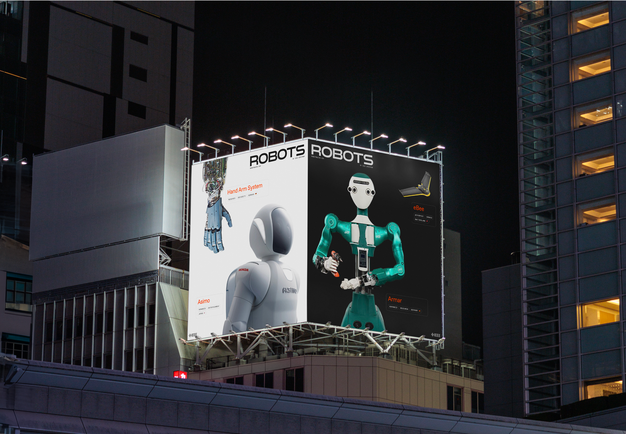
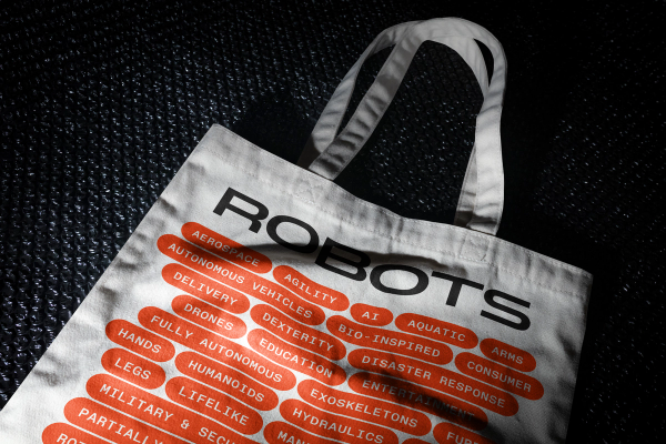
The visual identity draws directly from the structure of the dataset. Orange tags and grids of robot portraits serve both as navigation tools and as simple, flexible branding elements—on and off screen.
Skiff
Brand identity for web3 technology startup
2022
Philadelphia Inquirer
Editorial redesign of one of the leading daily newspapers in the United States
2022
Clo Floral
Wordmark and visual language for Portland, Maine’s premier independent floral artist
2021
IEEE Spectrum
Digital editorial experience for the IEEE’s flagship publication
2021
Tablet Magazine
Digital editorial experience for the online Jewish magazine
2020
Maker Park
Identity for proposed adaptive reuse park in Brooklyn
2016